Longevity in a Bottle
Optimizing packaging for optimized health.

WHAT IS HEALTHSPAN?
Healthspan is a tele-health startup that’s making innovative medicine accesable.
Healthspan’s health protocols, particularly it’s flagship Rapamycin medications, are focused on cultivating good cellular health. But unlike other services that sell these same niche medications, Healthspans new digital heath model provides trust, education, and personalized care to patients through data and technology.
THE CHALLENGE
OF GROWTH
Although the medicine has good research backing it up, there’s some unique growing pains from trying to grow beyond the niche market known as Longevity Healthcare.
The small market that does exist already is very muddled with conflicting information, over-priced concierge medical services, and sketchy pill mills. There’s a lot of well-earned distrust for new, untested companies like Healthspan.
There’s no easy visual or sell for new consumers. Both the science and the rewards of Healthspan’s services require patience and education to really click. No one outside of niche demographics know what the medications are, how they work, or why it’s important to be taking these preventative health measures.
Healthspan’s decision to create a full packaging line for it’s prescription medication is a tactful decision to elevate thier patient experience and create a new visual language for these medications.
THE PACKAGING PROCESS
Where we started from?
Healthspan’s old packaging was a placeholder to help distinguish the different products.
Less of an identity, more of a quick necessity.
EXPLORATION AND DEVELOPMENT
We were asked to conduct market research and create a packaging that would elevate us above others using our core tenants.
Trust
Education
Science
EDUCATION THROUGH ILLUSTRATING
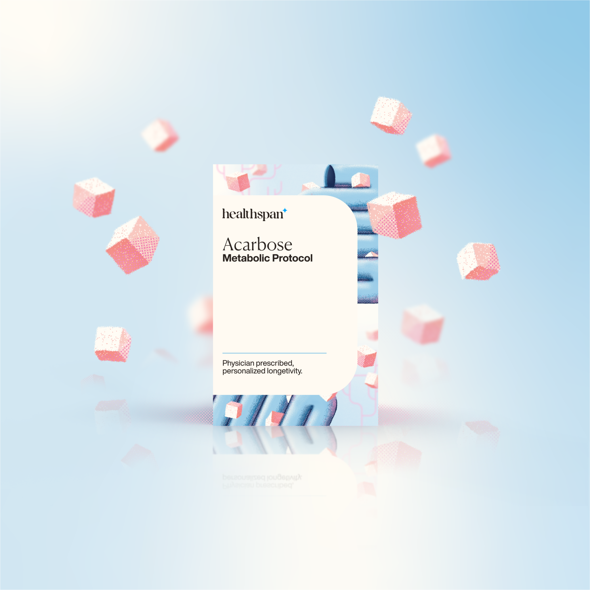
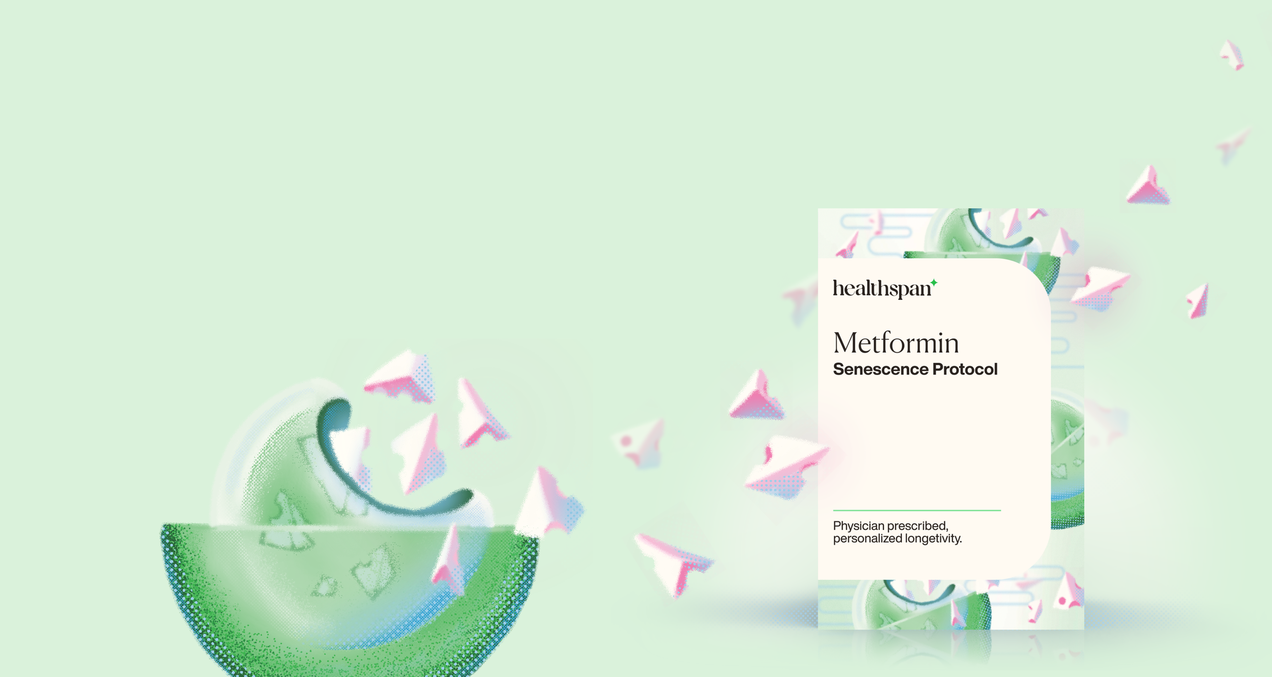
The illustrations tied education into the packaging with a branded illustration system prompting curiosity to learn more through Healthspan’s many educational services and inciting trust and comfort at a glace.

ONE BUSINESS GOAL AT A TIME
An iterative approach allowed us to continually update as Healthspan grew.
This initial packaging solution, crafted to highlight our high-quality medications during a new product launch, succeeded and was applied across Healthspan’s whole cabinet of medications.

POST-LAUNCH
After the Acarbose launch Leadership feedback throughout the proccess was positive, but after rolling out our new packaging system.
We decided to re-align the packaging to upcoming developments that was focused on software and technology.

The Next Iteration
After more market research and team syncs to restate and align goals, we pivoted to an identity more focused on science, data, and research.
Our identity had been very medication focused because that’s all we had, but as Healthspan rolled out more of it’s digital services, the brand needed to focus more on it’s unique features and update our core tenants:
Trust
Education
Science
Data + Technology
Simple.
Direct.
Honest.
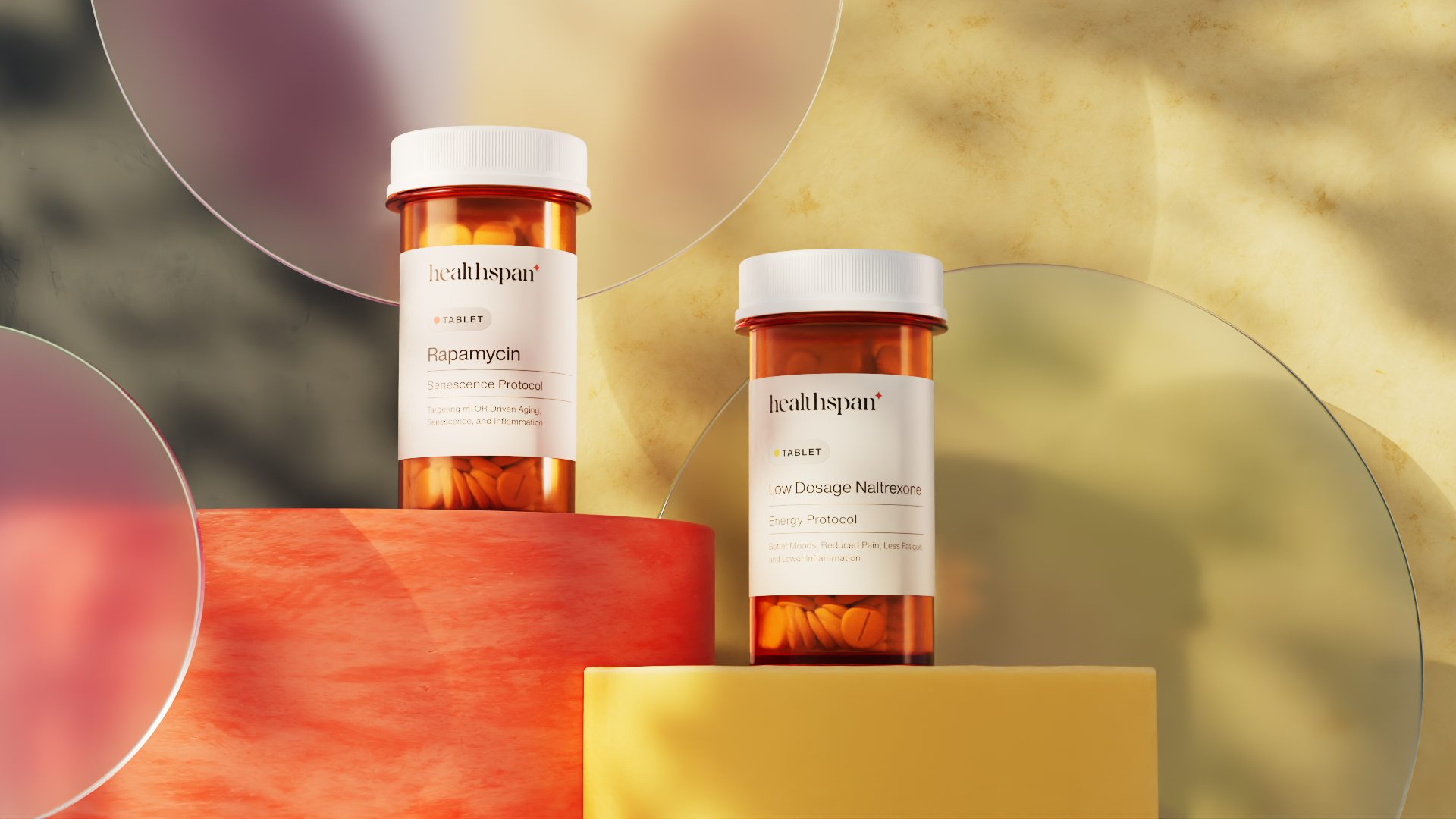
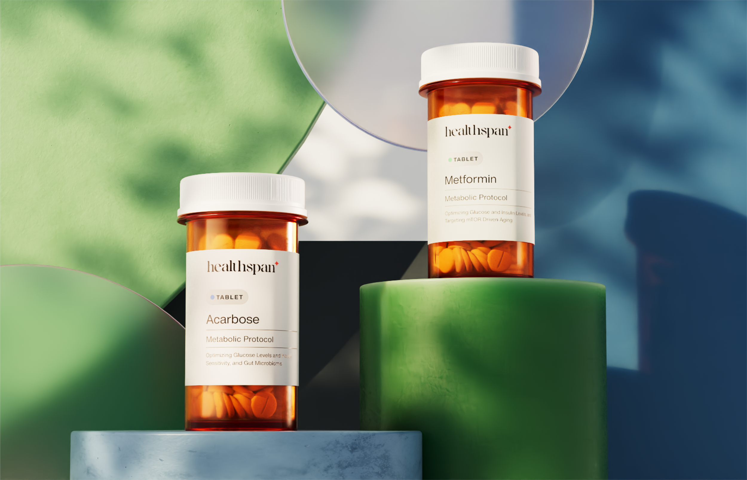
Healthpan has real doctors prescribing your medication. By invoking the instantly recognizable orange bottle we highlight our professional clinical accreditation and align with patient expectations.
Scaleable to an expanding cabinet.
Warm tones, including logo red, for our flagship product, Rapamycin.
Secondary cool palette for secondary products.
Exciting new products get bright tertiary pop colors.

HIGHLIGHT, NOT OUTSHINE
What makes Healthspan special is it’s software and data-driven care and services.
By crafting a packaging solution that was elevated but subdued we could use it to highlight, not overshadow, the services that turn a prescription into a full healthcare plan.
PROJECT TAKEAWAYS
The takeaway that I hadn’t experienced at other jobs was the value and experience of efficient, ongoing iterative design.
Yes we had to be flexible and pivot, but we created design work that could carry itself forward even as Healthspan’s products, services, market, or leadership necessitated big changes. Each month we created new foundations that would hold up and support us as we grew into other directions while allowing us to pull back or drop other elements. It’s something that every design project utilizes, but the scope of length of this project made me work through design pivots in a way I can carry forward into my next projects.


